Pivot Charts in Excel Tutorial
This Pivot Charts in Excel tutorial is Suitable for users of Excel 2010/2013/2016/2019 and Microsoft 365.
Objective
Create an interactive Pivot Chart in Excel from a raw dataset and customize it to suit your needs.
What is a Pivot Chart?
Whenever I hear the word ‘Pivot’ I immediately think about that scene in ‘Friends’. Ross, Rachel and Chandler struggling to lift a couch up a very narrow stairway. Fortunately, Pivot in the context of Excel is a much simpler affair and not quite as shouty. Unless you accidentally delete your Pivot Chart then all bets are off.
Pivot Charts are used in conjunction with PivotTables. A PivotTable helps you summarize your raw data and extract meaning from a large dataset. However, sometimes it’s still hard to see the big picture. A Pivot Chart in Excel can instantly help you visualize large datasets, make better decisions and tell the story of your data. Every element of a Pivot Chart can be modified and customized and with useful tools like Slicers, it makes viewing your data against different criteria simple and easy for everyone.
In short, Pivot Charts are awesome and definitely something you need to have in your Excel toolkit!
There is a common misconception that in order to create a Pivot Chart, you must first create a PivotTable. This isn’t necessarily the case. You absolutely can create a PivotTable and then create a Pivot Chart but you don’t have to.
However, it is very important that prior to creating a Pivot Chart (or a PivotTable for that matter), that you ‘clean’ your data. This is especially important if you are using a dataset that you didn’t create, i.e. imported from a database, another Excel file etc. Cleaning data is the process of removing errors, blank rows, duplicates and also checking for consistency in your data. If you do not do this, any results you see in your Pivot Chart could be inaccurate.
To learn the different techniques for cleaning data in Excel, check out the following blogs:
Microsoft – Top ten ways to clean your data
Trump Excel – 10 Super Neat Ways to Clean Data in Excel Spreadsheets
Simon Sez IT – Data Cleaning in Excel in 1 Hour
In this example, we are starting out with a large dataset (21,574 rows), that has already been cleaned and formatted as a table. The data is Sales data for two different stores in the UK. The table has been named ‘SalesData’.
Method
1. Creating a Pivot Chart Open the Excel workbook that contains the data you want to analyze and ensure your mouse is clicked on a cell contained within your data.
2. Click Insert > Pivot Chart


The ‘Create Pivot Chart’ dialog box will open. You need to specify the cell range that contains the data to be used in the Pivot Chart in the ‘Table/Range’ field. If you have not named your data range, you can simply select the cell range manually. In my example, I named the data range ‘SalesData’.
Next, specify where you want to create the Pivot Chart. I always recommend separating the raw data from the Pivot Chart and putting it on a ‘New Worksheet’.


3. Click OK
A new worksheet tab will be created. On the left is a blank PivotTable, in the middle a blank Pivot Chart an on the right are the Pivot Chart fields.
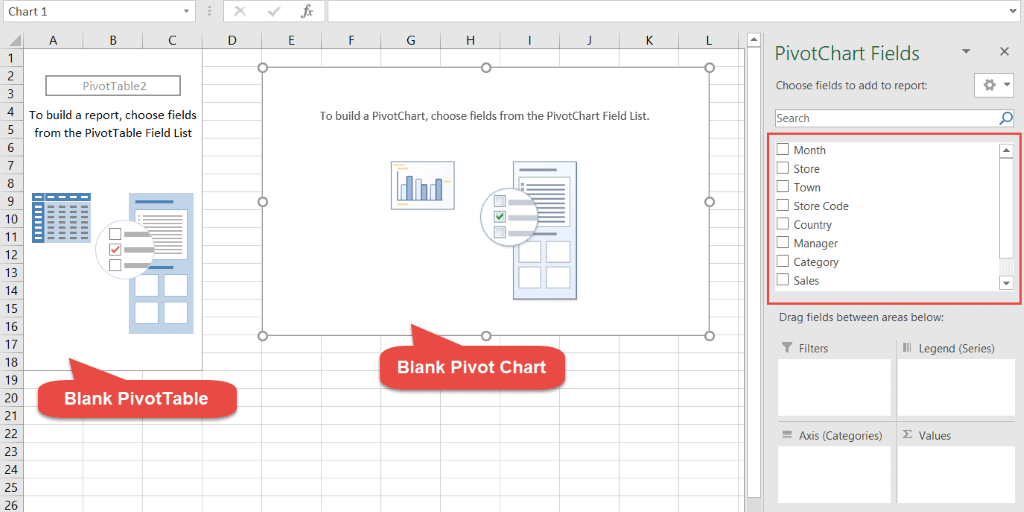

The Pivot Chart fields correspond to the column headings in the raw data worksheet.
To build a Pivot Chart, drag any of the fields and drop into one of the four areas at the bottom. Which field you drag and drop into which area will determine how your data is displayed in the Pivot Chart.


For example, I would like to see a summary of the total number of sales for all store managers.
- Drag the ‘Sales’ field to the ‘Values’ area
- Drag the ‘Manager’ field to the ‘Axis(Categories)’ area
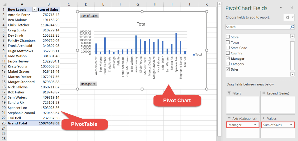

Now, I want to see a summary of the data, broken down by store.
- Drag the ‘Store’ field to the ‘Legend (Series)’ area.


Next, I want to see a summary of the sales by category.
- Untick the ‘Store’ and the ‘Manager’ field in the Pivot Chart fields list to remove them.
- Drag the ‘Category’ field to the ‘Axis Categories’ area.


This is a basic Pivot Chart. Fields can added or removed depending on how you want the Pivot Chart to display the data.
Formatting Pivot Charts
There are many utilities available in Excel to format Pivot Charts. Click on the Pivot Chart to see the ‘PivotChart Tools’ contextual ribbon.
The Analyze tab
The Analyze tab contains tools to help you interpret your Pivot Chart. Give your chart a name to make it easy to identify. Add Slicers and Timelines to filter the Pivot Chart. Change your data source, or refresh the current data source if it’s been updated. Move the Pivot Chart or create formulas using calculated fields.


The Design tab
The Design tab contains tools to help you format and label your Pivot Chart. Add chart elements such as a title, a legend or axis labels. Modify the layout and change the color of the chart. Select a different chart style or change the chart type or switch the row and column data.


The Format tab
The format tab contains tools to format every element of your Pivot Chart. Change the fill color, the outline color or add effects.


In this example, a legend has been added to show the two stores represented in the Pivot Chart. Horizontal and Vertical Axis titles have been added. The chart style has been changed and the chart area has been formatted.


Adding Interactive Elements
Slicers and Timelines enable you to filter the Pivot Chart and target the information of interest to you.
Add a Slicer
- Click on the Pivot Chart
- From the PivotTable Tools ribbon, select the Analyze tab
- Click Insert Slicer
- Select the field or fields you want to use to filter the Pivot Chart
- Click OK


Add a Timeline
Timelines are a Slicer specifically for data formatted as a date. Using a Timeline Slicer, you can display your Pivot Chart data for a specific date range.
- Click on the Pivot Chart
- From the PivotTable Tools ribbon, select the Analyze tab
- Click Inset Timeline
- Select the date field you want to use to filter the Pivot Chart
- Click OK


To clear filter selections for Slicers and Timelines, click the ‘Clear Filter’ icon
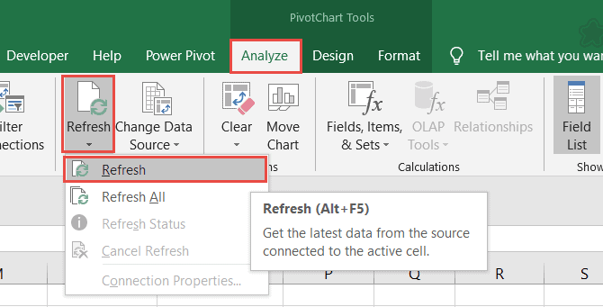
Updating a Pivot Chart
It’s more than likely that your raw data will change at some point. New data will be added so its important to know how to keep your Pivot Chart updated.
- Add the new rows or columns to the raw data table
- Click on the Pivot Chart
- From the PivotTable Tools ribbon, select the Analyze tab
- Click Refresh or Refresh All

Video Tutorial
To see Pivot Charts in action, please watch the following video tutorial.
For more Free Excel tutorials from Simon Sez IT. Take a look at our Excel Resource Center.
To learn Excel with Simon Sez IT. Take a look at the Excel courses we have available.

