How to Add Data Bars in Excel? 2 Easy Ways
(Note: This guide on how to add Data Bars in Excel is suitable for all Excel versions including Office 365)
A spreadsheet containing data without formatting looks blunt and unappealing to the viewer. To convey the core of the sheet effectively, Excel provides a set of predefined conditional formatting options for the data.
Instead of presenting the data plainly and bluntly, you can optimize the analysis with the help of conditional formatting options such as Data Bars, Color Scales, and Icon Sets in Excel. When you compare the three options, no format is better than the other as each serves a unique purpose in visualizing the data.
This article will show you how to add data bars in Excel.
You’ll learn:
- What Are Data Bars in Excel?
- How to Add Data Bars in Excel? (With Example)
- Additional Conditional Formatting Options Using More Rules
Related Reads:
How to Use Color Scales in Excel? A Step-by-Step Guide
How to Use Icon Sets in Excel? A Step-by-Step Guide
How to Use Cell Styles in Excel: A Step-by-Step Guide
What Are Data Bars in Excel?
Data Bars in Excel are conditional formatting options that add visual interpretation of the cell values compared to the rest of the data. The format option inserts a bar that portrays the cell value beside it.
You can use the Data Bar option to turn the viewer’s direction towards the focus data in your spreadsheet. The focus information could be sales growth (in percentage or values), results of candidates, logistics, and much more.
How to Add Data Bars in Excel? (With Example)
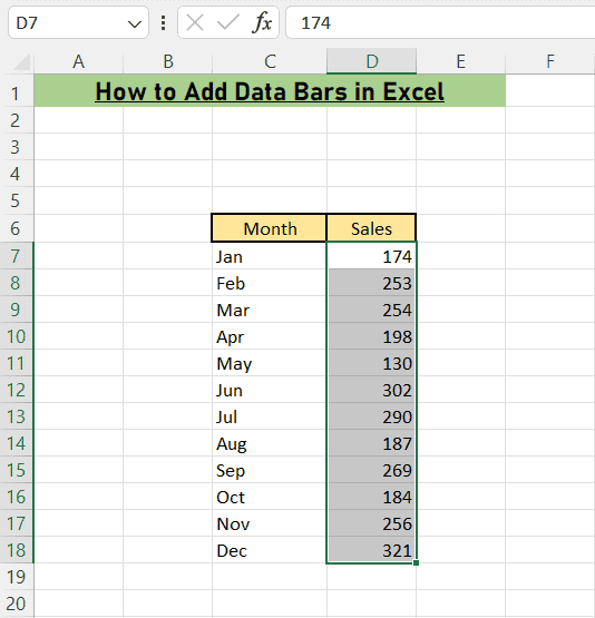
You can create a new spreadsheet to learn how to add Data Bars in Excel or open the existing file to add the format. In this case, let’s consider the following table representing every month’s sales.
- Open Microsoft Office → New → Blank Workbook to create a list as displayed. To open an existing workbook, choose the Open → Browse Files → Select the file where you want to add Data Bars formatting.
- Select the cell range by dragging or manually selecting the cells holding the Shift key. You can add Data Bars only to the cell containing values.


- Once done, click on the Conditional Formatting drop-down box found under the Styles section of the Home tab.
- The drop-down box shows the list of formatting options you can apply to the selected cell range. Choose Data Bars among those options.
- The Data Bars format consists of Gradient Fill and Solid Fill options that you can apply to the selected cell range.
- You can choose from the preset color options or the custom color fill using the More Rules command on the Data Bars menu.
- The Data Bars available in the section include a predefined set of colors to add bars on cells. Click any color to add data bars to your cell range.
- In this example, I’ve chosen the Gradient Fill to apply to the selected cell range.
- The Data Bars in Excel formats data in comparison with the largest value within the selected cell range and displays the length of the bar accordingly.
- In this example, you can notice that the highest cell value (321) is filled with the Data Bar, and the rest of the values are measured based on the highest cell value.
Suggested Reads
How to Calculate Square Root in Excel? 3 Proven Ways
How to Apply a Formula to an Entire Column in Excel? 6 Ways
How to Use the CEILING Function in Excel? A Step-by-Step Guide
Additional Conditional Formatting Options Using More Rules:
You can apply a few more formatting options to your table using the More Rules option from the Data Bars menu. For instance:
- If you want to hide or remove the values and display only the Data Bar, go to the Home tab and click Conditional Formatting → Data Bar → More Rules.
- The New Formatting Rule dialog box appears.
- Under Edit the Rule Description, you can apply the Show Bar only option in Format Style to remove the value beside the existing Data Bar.
- Click OK to apply the format to your data.
- The Show Bar only option leaves the values unknown to the reader and portrays the importance of growth and loss measures.
- Under the same dialog box is the Bar Appearance section. You can customize the color, outline/border, and even change the direction of the bar according to the values.
- You get a quick preview of the Bar design on the same window. This is a neat feature by Excel to reduce the time spent checking the design each time we make a change.
We saw the additional formatting options for adding Data Bars in Excel. Once you start customizing, you can get a broader view of the conditional format instead of limiting it to results and report analysis.
Also read:
How to Recover Unsaved Excel File? – 3 Ways
How to Insert a Page Break in Excel? (3 Simple Steps)
How to Change Row Height in Excel? 5 Easy Ways
Frequently Asked Questions
What is the use of Data Bars in Excel?
Data bars in Excel are formatting options used to add bars representing the cell value compared to the rest of the data. The Data Bars format can interpret reports, results, sales output, and growth. It can be used to differentiate the performance of various candidates, workers, or evaluations based on the scores.
How do I quickly apply the Data Bars format in Excel?
The simplest method is to hover the mouse over the Home tab, select the Conditional Formatting drop-down box, click on the Data Bars option, and choose the color fill you want to apply to your data.
What are the conditional formatting options used to explain a given data better?
Excel offers three graphic conditional formatting options:
1. Data Bars,
2. Color Scales, and
3. Icon Sets.
All three conditional formats serve the purpose of enhancing visual data interpretation. However, better visualization is subjective to the presenter and the message they are trying to convey.
How to edit Data Bars formatting in Excel?
You can customize the Data Bars format using the More Rules option under the Data Bars conditional format. The More Rules option allows you to customize the Bar appearance, keep the bar by hiding its values, and create a custom format rule.
Closing Thoughts
The Data Bars in Excel effectively visualize the number and values. Unlike other formatting options like Icon sets and Color scales, the Data Bars conditional format transforms a plain data table into comparative analytical charts within a few clicks.
This article helped you better understand how to add Data Bars in Excel. Add Data Bars in your worksheet to deliver more engaging content and visually enhance your presentation.
Please visit our free resources center for more high-quality Excel and Microsoft Suite application guides.
Ready to dive deep into Excel? Click here for advanced Excel courses with in-depth training modules.
Simon Sez IT taught Excel and other business software for over ten years. You can access 150+ IT training courses for a low monthly fee.


