Powerpoint Presentation Tips and Best Practices
(Note: Suitable for users of PowerPoint 2016, 2019, 2021, and PowerPoint for Microsoft 365.)
Objective
Understand the dos and don’ts of effective PowerPoint design that adheres to best practice guidelines.
PowerPoint Presentation Tips and Design Explained
PowerPoint is a presentation application that helps us communicate our thoughts and ideas to an audience. It’s designed to assist the presenter, not to be a replacement for the presenter. However, simply ‘slapping’ together a few slides and adding some text and a couple of images doesn’t quite cut it in 2022.
PowerPoint has evolved in leaps and bounds over the last few years. No longer are we stuck with creating long, linear slide decks full of bulleted lists and text, inflicting ‘Death by PowerPoint’ on our audience.
Modern slide design tells a story. It allows the viewer to choose their own path through the presentation. We use animation sparingly and effectively. We think about color, font, and accessibility. We choose images over text and consider our audience before we begin our design.
The latest versions of PowerPoint (365, 2016, 2019, 2021) contain many new features to help us build a truly awesome PowerPoint presentation. However, the ‘rules’ with regard to effective design remain the same as ever. By knowing and employing a few basic best practice principles, we can create an attractive, modern presentation that communicates our message effectively.
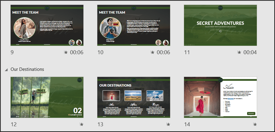

Related reads:
How to Wrap Text in PowerPoint
How to Add a Watermark in PowerPoint
How to Add a Hyperlink to a PowerPoint
Best Practice Guidelines
Best Practice Guidelines give us a framework from which to work within. Much like a blueprint, we can follow these rules to ensure we are designing our slide deck in the best way for our audience.
1. What is the Goal?
Before we begin, it’s important to establish the goal of the presentation, as this will affect how we design our slides. What are we hoping to achieve? Is this a Sales pitch to a potential client? Are we trying to sell a product or service? Is this an internal presentation for our team? Work out what the goal is prior to creating slides.
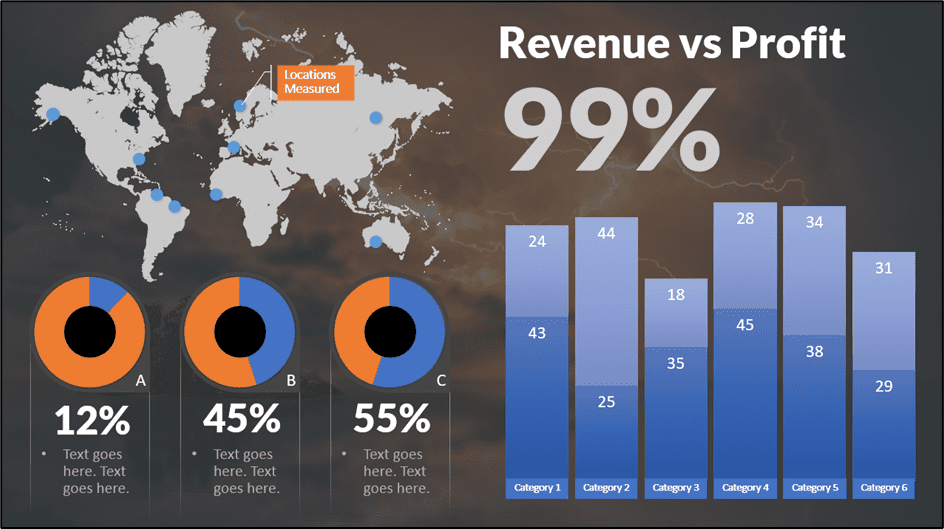
For example, if this is a sales pitch to a potential client, it’s important to get to the relevant points quickly. Identify early where you see problems and then offer solutions. This helps get ‘buy-in’, and the client understands how we can benefit their organization. If we present data in charts, ensure the charts are simple to read and communicate key metrics important to that client.
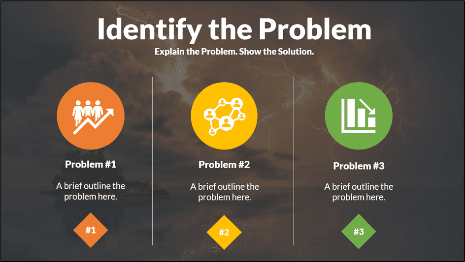

It’s also worth thinking about how to end the presentation. Do we want our audience to take action on something? Do we want to encourage them to follow us on social media? Or maybe we need them to go to a website and register for a newsletter. Maybe we want them to think about certain key points and provide feedback at a later time. Remember to include clear calls to action.


2. Know Your Audience
Establishing who we are presenting to is vital. Different audiences will require different slide designs. For example, if we are presenting to a board of CEOs and stakeholders, we need to ensure the presentation is professional, business-like, focused on key metrics, and establishes our brand. Whereas, if we are putting together a presentation for our local tennis club, we can afford to be more relaxed with the design.
Our audience determines how we design a presentation. It affects the types of images we use, which fonts and colors we use, and the messaging we work into the slides.
The environment also plays a key role. Will they be in a meeting room viewing the presentation on a projector? Will they be sitting next to you at your desk? Will they be receiving an email copy of the presentation? Will the presentation be on large screens at an event? For example, if we present in a large auditorium, we must ensure that even the people at the back can see everything. We need to consider font size, font style, contrast, and the types of images we use.
NOTE: Many times, organizations will have their own PowerPoint template to use for all company presentations. Templates ensure that every presentation is consistent, uses branded colors, and contains items like the company logo. We should always ensure that we are working within our organization’s branding guidelines when designing.
Try and establish these three key factors:
- Who will be watching?
- What’s important to them?
- What’s the environment?


3. Create an Outline
An outline is similar to a storyboard. We can plan out our slides ahead of time to establish flow, presentation length, and timings.
An outline can be something as simple as drawing out slides in a notepad and jotting down the key points to cover, or we can use PowerPoint to create a ‘wireframe’. A wireframe is simply a plan of how each slide will look and what content is to be included.
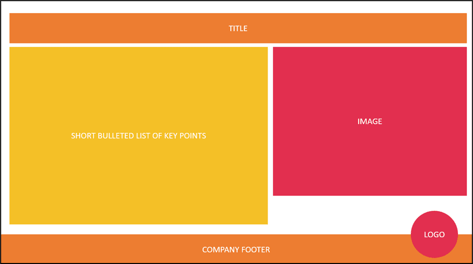

Establishing what needs to be included from the start means that we are less likely to forget to include important information, and we can plan our slide deck more effectively.
4. Decide on Visuals
Visual elements are a huge part of PowerPoint. The phrase ‘a picture speaks 1000 words’ is true, with most people remembering infographics, charts, and other images over bulleted lists of text. It’s important to think about the types of visuals to include in the presentation ahead of time. Do we want to use photos? What about charts? Are we going to use icons? What about video?


We can use multiple types of visual elements in our presentations, and we need to think about what will convey our message best. Also, think about the tone of the presentation and match any visual elements to that.
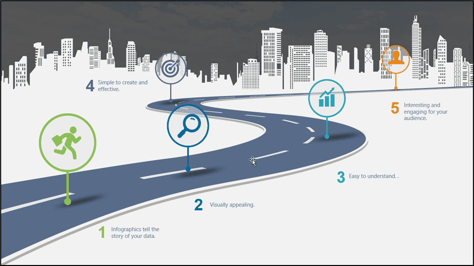

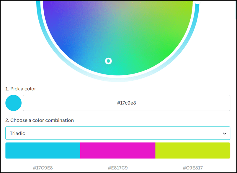
Color and font style are also very important. If company-branded colors do not restrict us, we need to think about the color palette of our presentation and ensure we use a selection of colors that complement one another.
If you struggle with color, the Canva Color Wheel is a great free tool for finding complementary colors based on a starting color.

5. Text. Less is More.
When it comes to text, less is definitely more. One mistake many presenters make is adding everything they want to say to the slide. Too much text renders the presenter redundant. PowerPoint is designed to be a presentation aid, not the entire presentation.
An audience should be focused on the presenter. Powerpoint can list some brief, key talking points, but the presenter should speak most of the information. If we have a ‘wall of words’ on a slide, it’s very difficult for the human brain to read and listen at the same time.
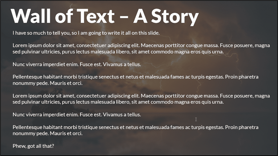

A good guide to stick to is ‘The Rule of 5/5/5’. No more than 5 words per line, no more than 5 lines per slide, and no more than 5 text-heavy slides in a row. Keep text to a minimum and break up text-based slides with images, charts, and other visuals.
6. Use Readable Fonts
Font selection is incredibly important, and not all fonts are created equally.
Over the years, I’ve seen many presentations ruined by crazy font choices. For business presentations, it’s best to stick to well-established, easy-to-read fonts: Arial, Tahoma, Calibri, Verdana, and Times New Roman are some of the most popular.
With that said, using the same font throughout the entire presentation can make our slide deck look a little stale and boring. Don’t be scared to use more than one font style, although try and stick to three or less. If we are going to use more than one font in the presentation, we should ensure that the fonts are from the same font family to keep things looking consistent and tied together.
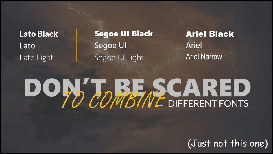

For example, we might use Lato font for the majority of the text in the presentation, Lato Black for the headings, and Lato Light for text boxes and sub-headings.
Stick to fonts that are easy to read even when the font size is relatively small.
A great website for finding complimentary font pairings is Fontjoy.
Suggested reads:
How to Change PowerPoint Slides to Portrait
How to Change Slide Size in PowerPoint
How to Save PowerPoint as Video
7. Be Mindful of Color
Color can make or break a presentation. Choose the wrong colors, and at best, the presentation will look unprofessional and, at worst, will give people a headache.


We need to think about our color choices carefully. Choose high-contrast colors like white text on a dark background or dark text on a light background.


8. Design for Wide Screen
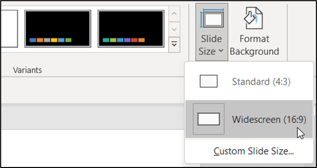
In PowerPoint 2021, we can choose between two slide sizes: Standard (4:3) and Widescreen (16:9).
Always design for widescreen! If we create a slide deck using the standard size and someone with a widescreen opens the presentation, PowerPoint needs to scale the presentation up, which can lead to problems, distortion, and misaligned objects. It’s much easier for PowerPoint to scale a presentation down.
- Click on the Design tab.
- From the Customize group, click Slide Size.
- Choose Widescreen from the menu.

9. Be Consistent with Style
It’s important that all slides in a deck look like they are part of that presentation. They should have a consistent look and feel. One of the best ways of tying slides together is to use color.
Choose a color palette of complementary colors and use them consistently throughout the presentation. Sticking to just a few colors prevents the presentation from looking like a rainbow.
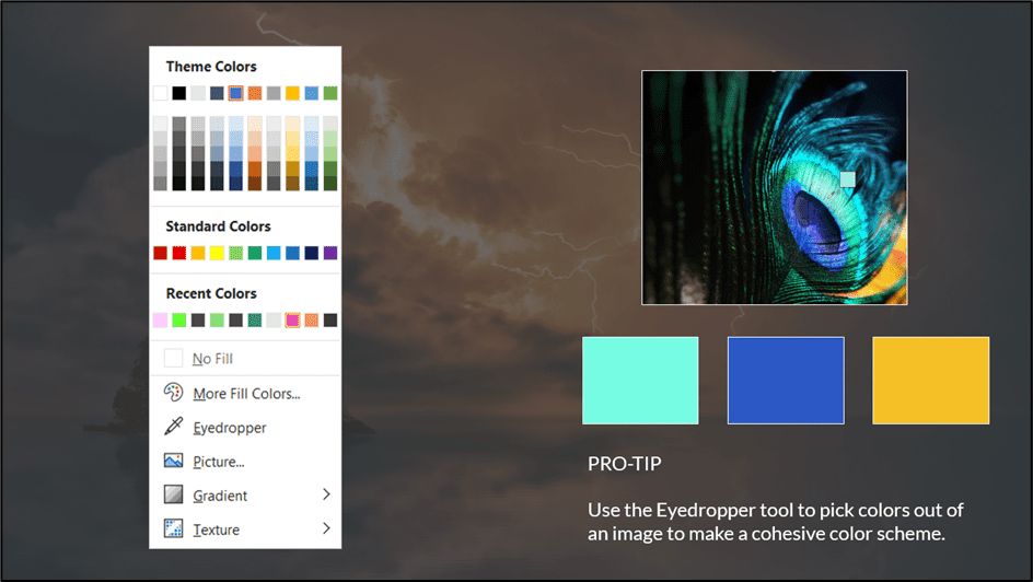
In PowerPoint 2021, we have a great utility called ‘Eyedropper’, which helps us copy colors from one object to the next, ensuring that we are picking the exact same color every single time. If we have an image on our slide, we could use the eyedropper tool to pick a specific color from the image and then use that color to fill another shape or icon.
We could even use the colors in an image to help build our own color palette.

10. Animation. Less is More.
Much like text, when it comes to animation, less is more.
How many presentations have you seen where the author has been a bit too enthusiastic with their animation effects? Text boxes fly in from the top, bullet points spin in from the left, and images pulsing in different colors. It’s enough to make anyone go crazy.
Animation when used correctly can really elevate a presentation and emphasize important points. Animation can also make our presentation look slick and modern. The key point here is ‘when used correctly’. The animation should enhance and not distract.
The rule here is to try and stick to less than three different animation effects in the presentation. Subtle animation tends to work better than something more dynamic and ‘in your face’.
For example, if we have a list of bullet points and we want to speak about the first one before the next one is visible to the audience, we might add a ‘fade in’ animation to the bullets. The second bullet point will subtly fade in and won’t give anyone in the audience a seizure.
11. Consider Templates
Templates give us a head start when creating a PowerPoint presentation. Instead of staring at a blank presentation, not knowing where to start, we could choose a template from PowerPoint’s template gallery and have a lot of the hard work done for us.

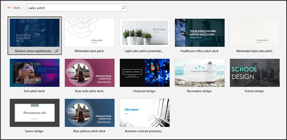
PowerPoint 2021 has hundreds of in-built templates available to use for free. All templates are divided into categories, and if we are looking for something specific, we can use the search bar.
- Click on the File tab.
- Click on New.
- In the templates section, type the search term into the search bar.

PowerPoint templates include pre-made slides, images, shapes, sample text, colors, fonts, and effects. Every element of the template can be customized to use your own colors and images.
If we can’t find a template that suits our needs, there are many websites that offer free and paid PowerPoint templates for download.
For free templates, check out Slides Carnival
For beautiful, high-quality paid templates, check out Envato Elements.
12. End with Action Points
We always want to make sure we end our presentations on a high. Leave the audience with action points or a task to complete.
For example, we might want our audience to provide feedback or get their opinion on the topic discussed. Or maybe we need them to complete a survey. Maybe we want to get them to follow us on social media, or we want them to complete an exercise. Whatever the action points, provide all the details at the end.
Sometimes, it’s worth mentioning at the beginning of the presentation that there will be some calls to action at the end. This can prevent people from zoning out or not paying attention if they know they will be required to do something at the end.
If we want to direct the audience to a specific website, we can utilize the QR Code add-in for PowerPoint 2021 so they can scan it with their phone.


Also read:
How to Make a Flowchart in PowerPoint
How to Link Excel to PowerPoint
How to Add Slide Numbers in PowerPoint
Please visit our free resources center for more high-quality PowerPoint and Microsoft Suite application guides.
Ready to dive deep into PowerPoint? Click here for basic to advanced PowerPoint courses with in-depth training modules.
Simon Sez IT has been teaching PowerPoint and other business software for over ten years. You can access 160+ IT training courses for a low monthly fee.


