Using Touch Screen Devices with Microsoft Project 2013
Synopsis
Use with touch screen devices is a major feature of Office 2013. In this article we look at the operation of Project 2013 with a touch screen device.
Increasing numbers of people are using devices with touch screens rather than the traditional mouse and keyboard combination, and now desktop software is being adapted to be used with touch devices as well.
One of the main problems with using a touch device is the accuracy with which you can access objects on the screen when you are using your fingers. This can be particularly difficult if you have big fingers or when what you need to do requires great accuracy.


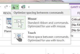
One of the main ways in which you can reduce this problem is to switch from mouse mode to touch mode, which you do using one of the buttons on the Quick Access Toolbar in Project 2013.
When you switch to touch mode, the separation between the commands on the ribbon is greatly increased, and it becomes much easier to select a specific command, or to select from the options that are available when you select certain commands with drop down menus or option lists.
Here is an example of the Project 2013 Home tab in touch mode.


Note that the exact content will depend on the screen resolution that is in force at the time. In general, though, because the commands are separated more there are less of them on any particular tab on the ribbon than there are when working in mouse mode.
Another way in which you can make it easier to operate Project 2013 with a touch device is to use the contextual menus and mini toolbars. When you are working in mouse mode and right click on most objects you normally see both a contextual menu and a mini toolbar.
In touch mode the equivalent action is to tap and hold on an object. You then see a mini toolbar.


The contents of the mini toolbar depend on the object selected, but note how the commands on it are well separated and easy to use with touch.
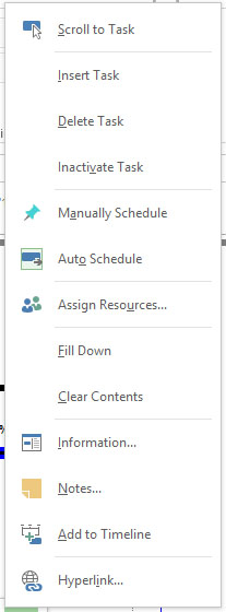
At one end of the mini toolbar is a drop down arrow. Tapping on that gives access to a contextual menu. The menu items are also well separated for touch use.


Note that both the contextual menu and the mini toolbar tend to be a little different in content from their mouse mode counterparts.
One other very important aspect of using touch with Project 2013 relates to making selections. The selection markers for Office 2013 in general and Project 2013 in particular are a pair of small circles, as you can see in the example below. To select a range of tasks, for example, select the first task by tapping and holding in the ID column. You then see the task highlighted with the round selection markers above and below it.


Tap the lower marker and drag down (or the upper marker and drag up) to extend the selection. Once you have made a selection you can perform whatever action you want to on the selected tasks, such as deleting, copying or marking complete.
You don’t have to select whole tasks, of course. You can select an individual cell by tapping and holding and then extending the selection up, down, right or left by tapping and dragging one of the two round handles.
Selection of other objects in Project 2013 works in a similar way.


