Using Burndown Reports with Microsoft Project 2013
Synopsis: A Burndown Report includes graphical comparisons of planned, completed and remaining work and tasks. In this article, we look at how to use this newly-introduced feature of Project 2013.
Burndown Reports have become popular amongst users of lighter project management methodologies. But they can provide useful information in an easily-understood form whatever your approach to your projects.
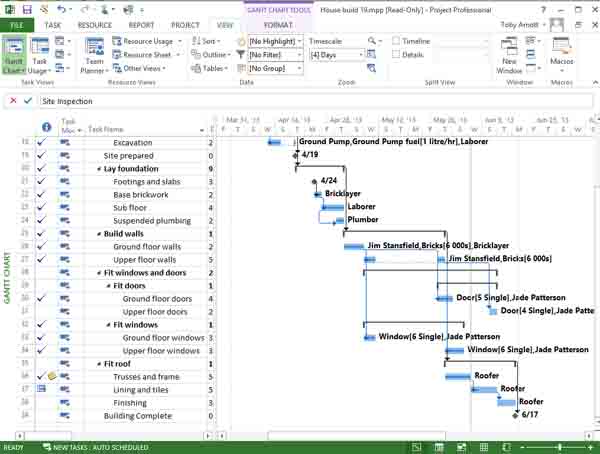
Here is a sample building project that is well behind schedule. Bad weather has delayed work on the structure of the house. And not enough has been completed to allow work on the inside to get back on track so far.


Let’s create a Burndown Report to provide a view of how things stand.
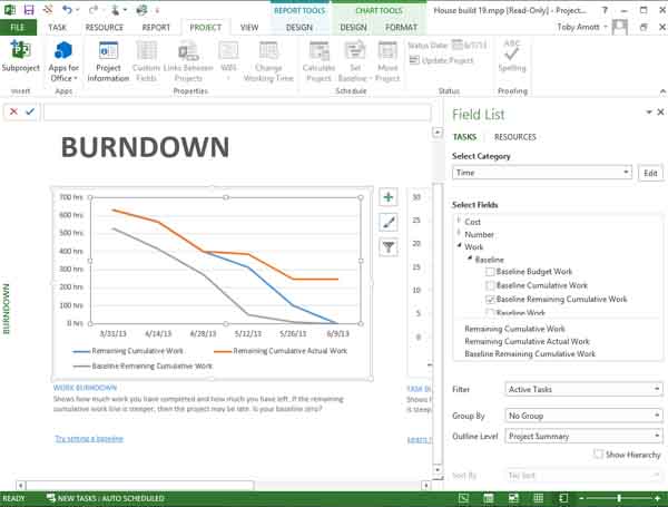
On the Report tab in the View Reports group, click Dashboards and select Burndown. This produces the default Burndown Report that shows a Work Burndown Chart and a Task Burndown Chart. Here is the current Work Burndown Chart for this project.


The vertical scale indicates the amount of work and the horizontal scale corresponds to time.
The grey line indicates how much work remains to be done according to the baseline. The baseline is usually the schedule that project progress is measured against, so the Project Manager is usually looking to stay at or below that in terms of work remaining.
Staying at or below that line indicates that the project is running to plan according to the amount of work done.
The blue line corresponds to the current schedule, i.e. what is actually happening. In this case, the blue line is above the grey line, which indicates that the project schedule is running behind the baseline.
As the caption says, the blue line is steeper than the grey one indicates that the project may be late.
Project Management Got You Confused? Get a Free Course for Microsoft Project 2013 – Click Here
The red line shows the remaining cumulative actual work, i.e. the total amount of work remaining at a point in time. A “flat” section indicates a period when little or no actual work was done, as the remaining total amount of work didn’t significantly fall.
The other chart that comes as part of the default Burndown Report is the Task Burndown Chart.


This shows the number of tasks remaining. Clearly, as a project progresses we expect the number of remaining tasks to decrease as tasks are completed.
The baseline here is in blue, with the current performance on completing tasks being shown in red. The red has been running above the blue, so we’ve not been getting the tasks completed on schedule.
The Burndown Report is a good visual indicator of progress. Note, that in order for it to be meaningful you need to make sure that you are capturing information on work done and tasks completed accurately and that you realize that a Burndown Report will only be reliable to the last date that you did a complete project status update on both work and tasks.
The charts in the Burndown Report can be customized in the same way as other charts in Project 2013. For example, if you select the Work Burndown Chart above the Field List pane appears on the right and you get two sets of contextual ribbon tabs, i.e. a single Report Tools Design tab and a pair of Chart Tools tabs.


Using these you can change the fields plotted, line colors and so on and produce highly-customized Burndown Reports and Burndown Charts.

