Creating a Chart with Excel 2010
Synopsis: In this article we look at how to create charts in Excel 2010.
The ability to create informative and good looking charts is one of the great strengths of Excel 2010. Recent versions of MS Excel have not only made this process easier, but have added powerful additional design and formatting features.
A chart is a visual representation of some data. Look at this worksheet of sales data for 2011.


The numbers corresponding to the individual sales and the various totals are included, but it is not easy to see any underlying trends or message. A chart can do this for you.
If you wanted to present a visual message about these sales figures you may want to show the sales for an individual, for a team, for a region or for the whole company. So, for example, you may want to show how Bill Armstrong’s sales figures for 2011 are looking.
The first thing to do is to select Bill’s figures. Here I’ve selected Bill’s name and the twelve numbers corresponding to his monthly sales.


Make that selection, select the Insert tab, then click on the arrow at the bottom of the Line button in the Charts group.


This lists the available line charts (also called line graphs) that are available. They are shown as small icons that give you an idea of what each will look like. Based on the icon you can choose a line chart type. However, if you make a choice and decide later it wasn’t the right one it’s not a problem as you can easily change the type later. Choose the top left one, and a line chart is created.


As you can see Excel 2010 has successfully worked out that “Armstrong, Bill” – which is in the first selected cell – is actually a good title for the chart. It has also treated the month numbers as the ones to use on the x-axis (category axis or horizontal axis). However, it doesn’t know what these numbers represent and it doesn’t know what the numbers on the y-axis (value axis or vertical axis) mean either. They’re just shown as numbers on the chart without any explanation. You can add some of this information manually if you need to, but some of it can be done by a better selection of data.
Let’s start again.
This time, select the data we did before and in addition select part of the row above that shows the month names.


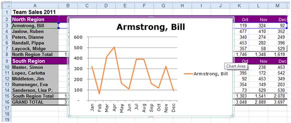
Now select the Insert tab, then click on the arrow at the bottom of the Line button in the Charts group and choose the first option again. This time, this is how the chart looks.


Excel 2010 has used the data in the additional selected row and now the category axis is labeled with the month names.
Let’s look at a very different type of chart.
This time we’re going to compare the sales for the members of the North Region sales team for the month of January 2011. First, select cells A3:B7.


Now select the Insert tab. In the Charts group click on the arrow at the bottom of the Pie button.


Select the first option in the 3-D Pie section. This is the resulting pie chart.


This pie chart provides a simple comparison of sales for the five team members for that month.
Excel 2010 has many types of chart, and they are almost all created using the approach we’ve covered in this article. First you select the data, then you choose the chart type and Excel does the rest. Once Excel has created a chart, there are many options for you to improve its design and formatting.


