How to Use Excel Functions to Forecast Data
(Note: Suitable for users of Excel 2016, 2019, 2021, and Excel for Microsoft 365.)
Objective
Use Forecast Functions in Excel to create a linear and seasonal forecast with upper and lower confidence levels.
Using Excel Functions to Forecast Data Explained
Forecasting is a technique that uses historical inputs to predict future values. Many businesses use forecasts to help them make better business decisions.
Forecasts help us predict the future and see trends in our data which can help us future-proof our business, determine where to allocate budgets and make informed decisions.
In Excel, we have numerous functions to help us create a forecast. Which functions you use will depend on the type of data included in the forecast. Also remember, that forecasting relies on time-based data. Ideally, our data should show changing values over a period of time.


Related reads:
How to Generate Datasets in Excel with Functions and Utilities
Dynamic Arrays: How to Use the Excel SEQUENCE Function and Unstacking Records
How to Use the AGGREGATE Function in Excel
Create a Forecast
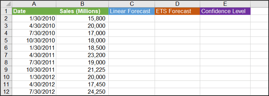
In this example, we have some sales data for a megastore over a period of time (2010-2021). We have taken a reading of our sales at 4 different points throughout the year, January, April, July and October. This pattern repeats for every year.


We want to predict what the sales will be for the next two years using forecasting.
Create a Line Chart
It can really help to visualize our data before creating a forecast. The best way to do this is to put the data into a line chart. Line charts work well with time-based data and are the best chart option to choose.
- Click anywhere in the data.
- From the Insert tab, in the Charts group, click Line Chart and 2-D Line Chart.


When the data is in a line chart, it’s a lot easier to see our data type. One thing that stands out about this data is the number of peaks and troughs.
This implies there is some seasonality to the data.
Seasonal Data
Seasonality means our data goes up or down at a certain point in the year. For example, if this data were related to Christmas Tree sales throughout the year, we would expect to see a peak around November/December each year and a trough in the summer.
Linear Data
Linear data is data that has a flatter, more consistent appearance. So, if our data slowly goes up over a period of time or slowly goes down, that is linear data as opposed to seasonal data.
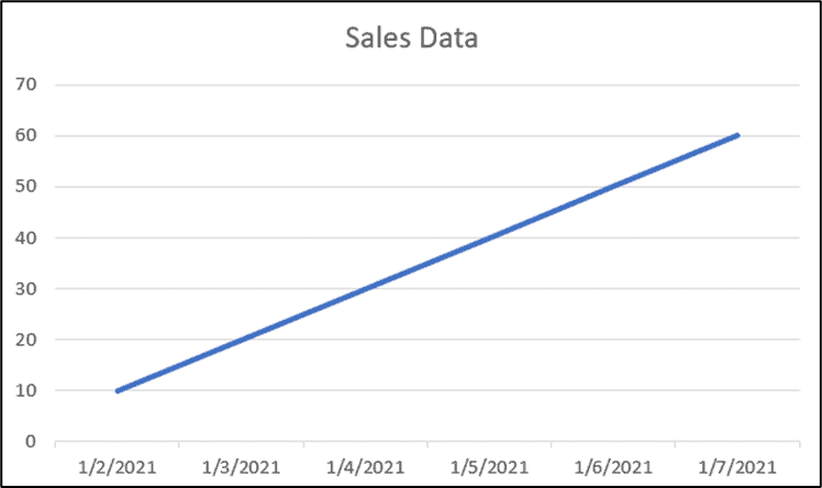

It’s important to determine if our data is seasonal or linear, as that will inform the type of forecast we do.
Linear Forecast
Even though our data is seasonal, let’s look at a linear forecast.
The first thing we need to do is add some dates to the bottom of our data as we want to predict future sales values. We are going to do a forecast for the next two years.
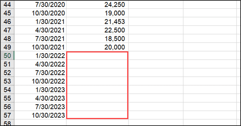

To differentiate the linear forecast, let’s add a column at the top titled ‘Linear’ to make things clear.


- In cell C50, type =FORECAST(
Notice we have quite a few forecast functions in Excel.
The bottom one, FORECAST is an old Excel function. We used to use this to create forecasts but better forecast functions have since replaced it. It is still available in Excel as a legacy option for users of older versions of Excel.


- Choose FORECAST.LINEAR
The syntax for this function is as follows:
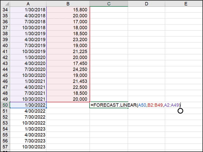
=FORECAST.LINEAR(x,known_ys,known_xs)
In this context, the x values are our dates, and the y values are our sales values.
The first argument, x, is the first date we want to predict.
- Select cell A50.
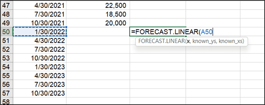

We then need to provide our known y values. Our y values are our sales values.
- Select cells B2:B49.
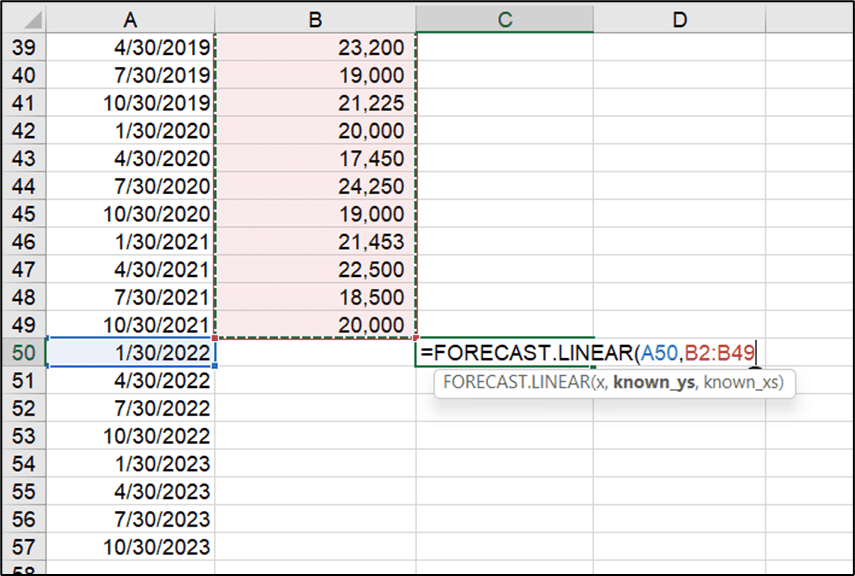

Finally, we need to provide our known x values. Our x values are our dates.
- Select cells A2:A49.

- Press Enter.
- Using the fill handle, copy the formula down.
These are our predicted values if our data is linear.


Let’s visualize this in a line chart.
- Select all of the data, including the new predicted values.
- From the Insert tab, in the Charts group, click the drop-down next to Line Chart and select 2-D Line Chart.


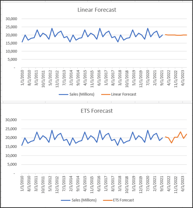
The blue represents our known data and the orange line represents our forecast values. Notice that the orange line looks a lot different compared to the blue line. This is because we have done a linear forecast which is better suited to data that is predictable with a smooth trend up or down.
So, a linear forecast on our data doesn’t really predict accurately our sales values for the next two years.
Suggested reads:
What-If Analysis: How to Create One and Two-Variable Data Tables in Excel
How to Calculate Mean in Excel
How to Use Excel FORECAST Function
Seasonal Forecast
Let’s now do a seasonal forecast which is more representative of the type of data we are using.
For this, we will use the FORECAST.ETS function. The ETS part stands for Exponential Triple Smoothing.
Add another column heading to the table called ‘ETS Forecast’.
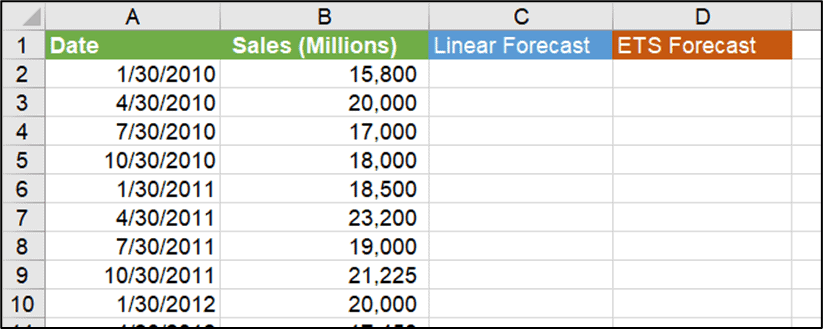

- Click in cell D50.
- Type =FORECAST.ETS(
The syntax for this function is as follows:
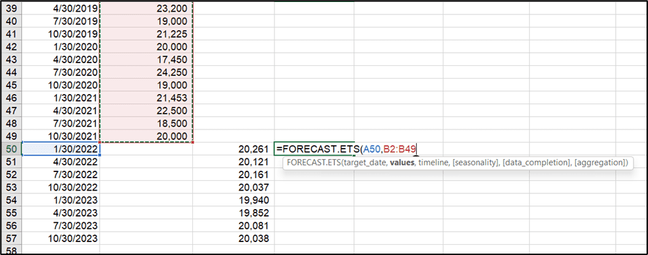
=FORECAST.ETS(target_date,values,timeline,[seasonality],[data_completion],[aggregation]
The last three arguments are optional, as they are in square brackets. Optional arguments mean they are not required for the formula to calculate.
The first argument is the target date, so that is the first date we want to predict.
- Select cell A50.


This time, instead of providing known x’s and known y’s, we provide values and a timeline. This basically means the same thing.
Our values are our known y’s.
- Select cells B2:B49.

Next, we need to provide our timeline or our known x’s.
- Select cells A2:A49.
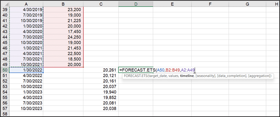

The next argument is [seasonality]. This is an optional argument. If we don’t provide an input here, Excel is going to try and work out the seasonality for us. We are not going to provide an input.
- Press Enter.
- Using the fill handle, copy the formula down.
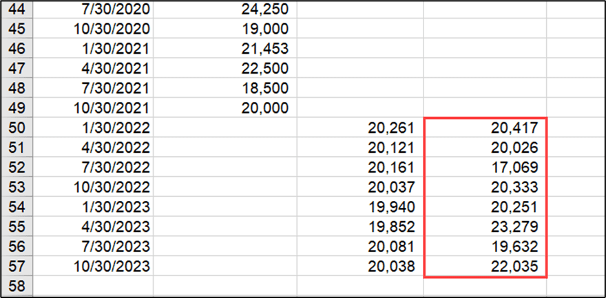

Let’s visualize this in a line chart. We need to make a non-contiguous selection to include the new predicted values. This means we are selecting data that is not next to each other.
- Select the cells that contain the dates and the sales values.
- Hold down Ctrl and select the data in the ‘ETS Forecast’ column.
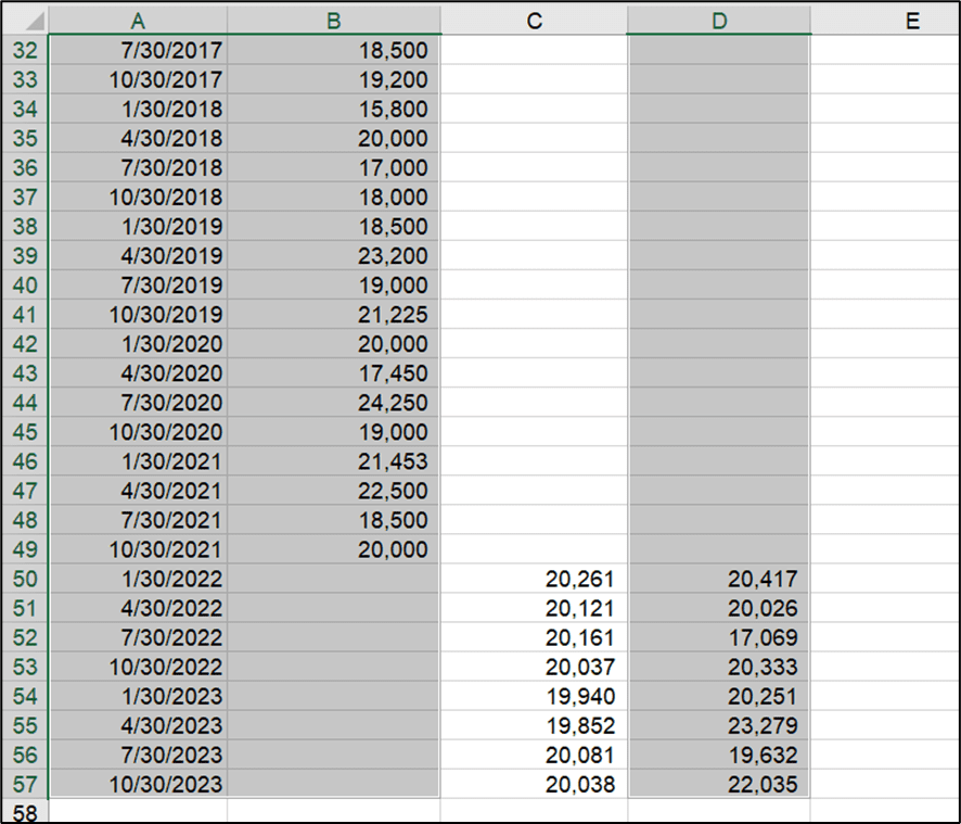

- From the Insert tab, in the Charts group, click the drop-down next to Line Chart and select 2-D Line Chart.


Notice the orange ETS Forecast line. This looks a lot more aligned with the known sales values in blue. Excel has done a pretty good job of working out our data’s seasonality and predicting future values.
Here we can compare the forecasts using both functions.

Confidence Levels
The last forecast we created was the ETS Forecast. The orange line shows the predicted future values for the next 2 years. Sometimes, what we also see on a forecast is a line above and a line below that represents the upper confidence bound and the lower confidence bound.
These are normally set to a percentage and the default in Excel is 95%.
This means that 95% of the predicted values will fall between the upper confidence bound and the lower confidence bound.
Let’s take a look at how we can show these on our forecast.
- Add another column to the data called ‘Confidence Level’.

- Click in cell E50.
- Type =FORECAST
- Select FORECAST.ETS.CONFINT
The syntax for this function is as follows:
=FORECAST.ETS.CONFINT(target_date,values,timeline,[confidence_level],[seasonality],[data_completion],[aggregation]
This time we have seven arguments. The last four are optional. The target_date, values, and timeline arguments are the same as in the previous example.
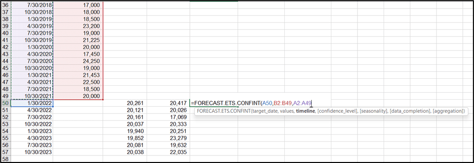

If we don’t add a confidence level, Excel will use the default of 95%. We will use the default and close off the formula.
- Press Enter.
- Use the fill handle to copy the formula down.


Now we have our confidence level, we can use these values to work out our upper and lower confidence bounds.
- Add two more columns called ‘Upper Bound’ and ‘Lower Bound’.


We work out our upper bound by performing a simple calculation. We know our predicted value for our ETS Forecast, so we need to add our confidence level to that value.


- Press Enter.
- Use the fill handle to copy the formula down.
This is our upper confidence bound. 95% of our values are going to fall below the values highlighted for each year.


We calculate the lower confidence bound in a similar way, except we subtract the confidence level from the ETS Forecast values.


- Press Enter.
- Use the fill handle to copy the formula down.
This is our lower confidence bound. 95% of our values are going to fall above the values highlighted for each year.


So, if we take the first line as an example where the predicted value is 20,417, 95% of our values will fall between 15,556 and 25,278.
We can now add our confidence levels into our line chart.
- Select the cells that contain the dates and the sales values.
- Hold down Ctrl and select the data in the ‘ETS Forecast’ column and the data in the ‘Upper Bound’ and ‘Lower Bound’ columns.
- From the Insert tab, in the Charts group, click the drop-down next to Line Chart and select 2-D Line Chart.


Also read:
3 Different Ways to Move Chart to New Sheet in Excel
How to Use Color Scales in Excel
How to Use Custom Number Formatting in Excel
Please visit our free resources center for more high-quality Excel and Microsoft Suite application guides.
Ready to dive deep into Excel? Click here for advanced Excel courses with in-depth training modules.
Simon Sez IT taught Excel and other business software for over ten years. You can access 160+ IT training courses for a low monthly fee.


